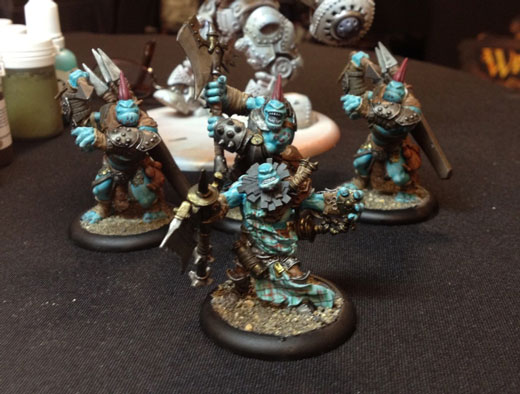
Where do I begin?! Last year at Lock & Load I had only been with the company for a couple of weeks, so I was a helper in the classrooms and not out and about with the rest of the studio. This year, however, I was with the studio at my own table, painting up my Trollblood Battlegroup Box and a Stormwall.
I decided to paint my Trollbloods because I still hadn’t learned to play. I figured I’d been with the company for a year, I should probably learn. Hard to believe it’s been that long already! So I spent a few hours each day getting my Trollbloods to tabletop standard. On Sunday, Chris Sarale, one of our PGs in Washington, taught me how to play. Chris gave me the play-by-play on what he was doing and why, and then Nathan Beck gave me a run-down of my options. It was just a short battlegroup game, but it really got me going. I had a great time and can’t wait to play again.
My Stormwall is for the Cygnar army I’m going to start. I was repacking some of my miniature boxes at home recently and realized I’ve collected a lot of Cygnar since I started at Privateer Press. Almost as much as what I’ve collected in Trollbloods. So I decided to add Stormwall and try out a new color scheme on the giant warjack. I started by priming it a rust color with the “hairspray technique” outlined in the back of WARMACHINE: Colossals. After applying the hairspray, I airbrushed it white. That way I had nice rusty battle damage peeking through my white basecoat.
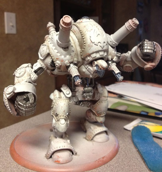
Once I had shaded the Stormwall a bit, I started putting a pearlescent finish over the white. The armor plates are white and everything else will be purple metallic, gold, and silver. This is just an in-progress shot taken at Lock & Load. I’ll be posting the finished miniature in a future blog.
In addition to getting some painting done, I also taught three classes this year. I’m sure you all can guess what the topic was—color theory! It seems to be my specialty these days. All three classes went really well, and I’m glad we were able to present this topic at Lock & Load. It was an hour-long class so I prepared forty-five minutes of presentation to allow for fifteen minutes of questions. My class was very much based off what I was taught in my art school, as well as information from Betty Edwards, who is a master at teaching color theory.
I wanted my students to ask lots of questions to make sure they understood the concepts I was presenting, and I figured I’d share some of the questions. Some are directly related to color theory and some are general painting questions.
Q: I want to paint Ashlynn d’Elyse a dusty rose color. What other colors can I use with pink?
A: Dusty rose or antique rose is a muted, soft pink. It’s not a very bright or saturated color. You can use a muted green, such as a muted olive, to complement the pink. Red and green are complementary colors and since green is present in olive and red is present in pink, you have a complementary color scheme. You have other options such as using muted purple or light, muted blue.
Q: I want to paint my army in a cool color scheme. You recommend using a warm color somewhere on the mini. Why?
A: Painting a mini in a cool color scheme can be done and done well. I recommend adding a color to the mini in small quantities that is the opposite temperature to the overall color scheme. This keeps the paint scheme interesting. Using colors that are all the same temperature can end up boring. So if you want to use cool blues on a mini, introduce a warm brown or a warm white. It will help break up the cool colors and the different temperatures will help create contrast.
Q: Out of all the studio factions, which one has the highest level of contrast? Why?
A: All of them have the same level of contrast. Contrast is relative to the color that will be most visible. For instance, Retribution of Scyrah and Khador have the same level of contrast. The Retribution white is going to have a lighter value than the Khador red starting out. The shadows used in both schemes still provide the same level of contrast, however. Retribution will go down to a medium grey while Khador will go down to a dark purple. This does not mean that one color scheme has more contrast than the other. The majority of the color present in the final paint job will be of lighter value in Retribution and a darker value in Khador. The shadow colors for each will be the same steps away from the highlight colors, just in different areas of the value spectrum.
Here is where I shall end this blog entry. I still have plenty to say about Lock & Load, and I hope I can share it in another blog entry soon. After having such a great time and meeting so many interesting people, I am very much looking forward to next year!